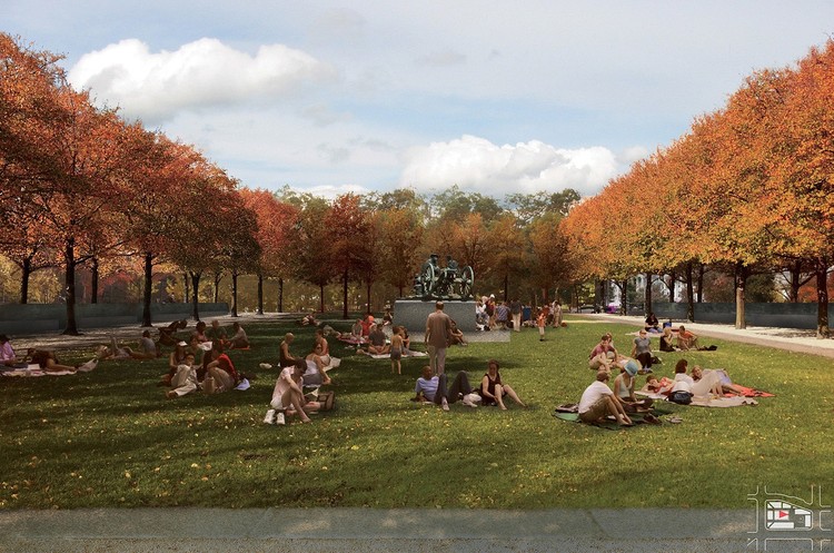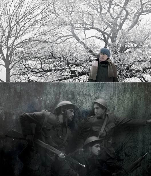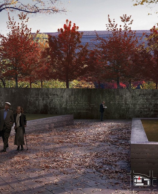
Last week, the World War I Centennial Commission announced architect Joseph Weishaar and sculptor Sabin Howard as the winners of the WWI Memorial Competition held to redesign Washington, DC’s Pershing Park for the 100th anniversary of the conflict. For Weishaar, a 25-year-old project architect at Chicago firm Brininstool + Lynch, the key to the design was to integrate elements of both a park and a memorial into a cohesive whole; his design, "The Weight of Sacrifice," incorporates a raised lawn surrounded on three sides by memorial walls with sculptures designed by Howard. ArchDaily was given the opportunity to sit down with Weishaar to learn more about his winning memorial design, his response to the park’s critique, and what the future could hold for the young architect.

Patrick Lynch: Unlike a typical monument as an object, this project seemed to inspire monuments integrated into a larger park design. How did you interpret the prompt for the competition and what aspect of it did you find most important?
Joseph Weishaar: It was a big part of the prompt that whatever the final design was, it had to function both as a park and as a memorial and they were really interested early on in doing a hybrid of the two. And there’s really not that much precedent out there in the world for a park-monument. So that was definitely the biggest challenge coming into this. I think a lot of the designs in the end still kind of separated where they had a monument portion and a park surrounding it, or they focused on one or the other. So there weren’t that many that actually worked memorial elements into a park-like setting. I could pull maybe 20 of them out of the 350. I think it was important to create a good synthesis of park and monument to the point where you couldn’t really separate the two. The park is really built out of the memorial elements, so if you start pulling the memorial elements away then suddenly there’s not as much park space. Figuring out how to make a park that could blend with the architecture was really my biggest challenge.

PL: Explain your design intentions - what inspired you to lift the park up off the ground?
JW: The site as-is is really sunken in the center, and that was its attraction back in the 70s, 80s. A lot of park designs, like Rockefeller Center for example, feature sunken spaces that were thought to be really smart because they separated people from the chaos of the world so that, suddenly, you weren’t in the confusion of traffic. What people have found since then in urban studies and psychology experiments is that people actually prefer to see and be seen, and that’s how they feel most comfortable interacting in a public urban space. So for my design I wanted to raise up that center so that people can see into the park, and see back out. That was the biggest generator of the overall plan and landscaping plan.

PL: What makes your design a World War I memorial, as opposed to a memorial for another historical event?
JW: There’s a couple things going on. What we have are the bronze relief walls that feature a combination of text and imagery from the war. The North and South walls are filled with quotations from people before the war, journals and notebooks of soldiers during the war, and then recovery after the war. The same thing is going on with the relief image on the east wall of the park. It is all about the transition of the US from being an isolationist nation, all the way through stepping up to become a power on the world stage. But that story is told through people’s experiences and the humanistic expressions of those figures. That in a big way makes it a World War I memorial.
The other thing is that we’ve been very sympathetic toward a classical design in that the reliefs feature humanistic figures as opposed to abstract figures. That was something seen during that time period. The third thing is the use of bronze as a primary material because of its prevalence during that era, rather than using a newer material like stainless steel or a more synthetic material made by a process that was invented after the war.

PL: At what stage did you contact Sabin Howard, and what aspects of his work made it the right fit for your design?
JW: He came into play after I made it onto the shortlist, stage 2. I had already come up with the idea of putting relief panels together but the commission, through our meetings and reviews, said, “this is great, but you need to contact someone who knows something about sculpture, at least to help you get a sense of if this is too much and what it would take.” Because originally, I had planned for 324 feet of sculpture. So I said, “OK, good point, I’ll find a sculptor somewhere.” And so I literally just googled “Sculptor United States” and came across the national sculpture group’s website and started clicking through sculptors they had listed there. I went through about 100 before I came to Sabin’s work. What I saw in Sabin’s work was, first of all, a high level of craft, and really a passion for process - but also it looked like, if I could have done the sculptures myself, what I would have wanted to do. And so that was a big draw to him. And once I got to know him, he ended up being one of the top classical sculptors in the country, so it worked out well.

PL: It has been mentioned that your design bears similarities to the the original design for Pershing Park. Did you intentionally draw from the park's design, or was it a product of the program and site context?
JW: It’s a little bit of both. I would say there is a heavy, heavy influence from the existing Pershing Park. Something that I’ve been trying to communicate to people throughout the last week of talking through it is that Pershing Park is actually a really nice park, and if you get into studying the plans as much as I have through this competition, there are things that work really well in the original design, and things that I didn’t think the park should lose. Especially around the existing Pershing Memorial. The north side of the park, where the bench seating is - that’s one of the best views down Pennsylvania Avenue to the Capitol. So for me it was very important not to get rid of those things. And, the thing is, I knew preservation was going to play a big part in the decision and how people saw this park. So from very early on, instead of just taking the site and completely wiping it clean, I tried to pick up as many elements as I could to be saved, and eliminate the things that didn’t work.

PL: There has also been worry from parties such as the Cultural Landscape Foundation that redeveloping the park would mean losing an existing park of historical significance. How would you respond to this criticism?
JW: Carefully [Laughs]. I’m looking forward to doing a lot of work with them to ensure that they are happy with the elements that get changed. At the same time, it’s hard to figure out exactly what their case is based on. There is only so much worth saving, and if there were more, it should have been maintained a long time ago, or been put on the register a long time ago. The fact that they are just coming to defend it now, because of the competition, is a bit strange. I think that changing the park into this memorial will make it the historic site that they are looking for, and, hopefully, it becomes the great park that they want it to be.

PL: When designing for government projects, it's common for winning competition designs to change in the process of getting them built. Have you received any feedback yet on how your design may change?
JW: I’ve only received relatively minor feedback so far. I know the commission wants to see more circulation options for people to come up into the plaza on the upper level. Right now the only entry is from the west side, so they want to see if they can get people in and out of that area better.
The sculpture is going to go under full review, because there are things that need to be played up a lot more. Sabin and I worked in a relative vacuum the last 4 months. Neither of us are historians - we picked out events from the war that we thought told a good story, and same thing with the quotations on the north and south sides of the walls. We picked quotations that we thought captured the essence of the war, but we’ll go into a full review now with actual historians and people who have read all the journals and know what to look for to help us reanalyze all those things. So there will be some changes. But the spirit of the design will still be there in the end.

PL: Winning a competition of this scale at your age is something that hasn’t been done often before, but there is one obvious precedent - Maya Lin's design for the Vietnam Veterans Memorial. That project ended up setting the tone for her entire career that now includes large scale land art. How do you think winning this competition will affect your career and the types of projects you will want to pursue in the future?
JW: I hope it doesn’t, as I like to say. Because I want to have some flexibility. I think the thing that hampered Maya a little bit is that she was really torn between being an artist and being an architect, and she wasn’t sure which one she wanted at that time in her life. Whereas at this point in my life, I am full architect - that’s where I want to go. So I’m hoping I don’t run into any sort of stumbling period or search for where I want to go and instead can just move on and take new projects. Hopefully it becomes a launching point for my career rather than the thing that grounds it and becomes the high point.
I actually got to meet Maya back in October (after competition finalists had been named). She told me to have a good sense of humor and said, “I’m glad it’s you and not me again.” She was really nice, and I’m hoping I can get in contact with her again now that I’ve made it to this stage to try to figure out how to deal with the stress and the pressure and life after.

For more information on Weishaar and Howard’s winning design, visit the World War I Centennial Commission’s website at ww1cc.org/design.


